PART 1 - FONTS
Introduction and sources
This document is aimed at the training industry and contains hints and tips that we have gathered as a leading training industry provider of printed materials and eBooks. We have also included advice provided from the National Autism society (https://www.autism.org.uk/), the British Dyslexia Association (https://www.bdadyslexia.org.uk/ ) and various academic papers from the International Journal of Social Science and Business. We are trying to spread best practise, as we understand it, but if we have made an error or you have a point to add then please email david@pdi.co.uk
For many adults there is little understanding of the learning difficulties some face because training and education is presented as the written word. For those without dyslexia try reading the document at the end of this explanation web page to gain a little insight in to the issue:
Read this font: https://danielbritton.info/dyslexia/
To make training as inclusive as possible, all of us can be mindful of how we present the written word, whether that be in print or electronic book. The benefits of the two media types are discussed later. There are various things we can do to increase accessibility. This blog covers the subject of font choice, later blogs will cover the issues of composition, colours, alignment, font size and spacing.
Before diving into a discussion of fonts we would point to the extremely valuable advice given in the academic paper by Beard, Akpan and Nottar (ref: https://www.ijssb.com Vol. 4 No 2; June 2019) – namely we should understand that ‘what works for one individual may not always work for all’. There is no ‘silver bullet’.
So why are some fonts better than others?
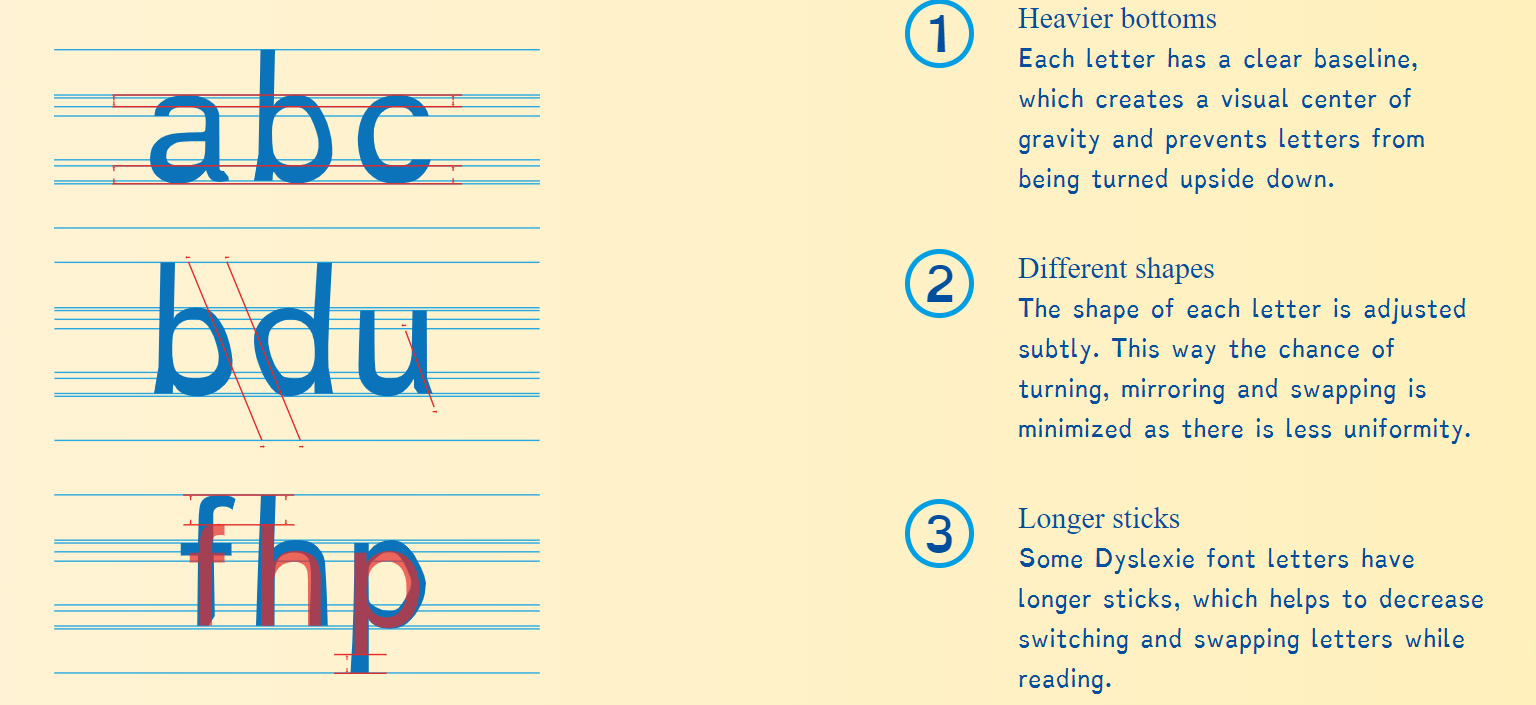
The issue with the written word is that letters can become an optical illusion. Letters can become mirrored or transposed and the differentiation between say an h and n can get lost because of the height of the down stroke or ‘stick’.
The designer of the specialist dyslexic font – Dyslexie – gives this explanation as to why his font is easier to read: (https://www.dyslexiefont.com/en/typeface/)
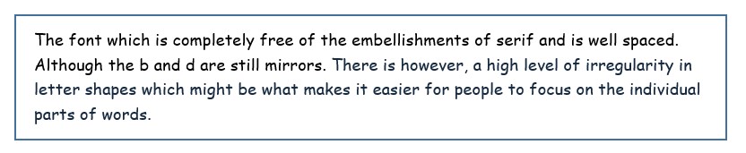
So with those general rules in mind a couple of special fonts have been designed Dyslexie (above) and the font OpenDyslexic – which looks like this:
Note the way the b and the d are not mirrors of each other and the letters are weighted toward the bottom. Also, note the large gaps between words to avoid them running into each other.
Are some fonts better than others?
If you do not wish to use a specialist font then it is clear that some fonts are better than others. Many teachers in the UK insist that the best font is COMIC SANS as in
The scientific papers suggest there is no significant difference between Comic Sans and other Sans Serif fonts. But, according to multiple surveys and studies, the most readable fonts tend to be the fonts that are known as sans serif or “without serif.” The word “serif” is French and signifies the little tail attached to the end of a stroke in writing some letters. Many of us don’t notice these little add-on flourishes, but they can make it difficult for struggling readers to know where letters and words start and end.
And so any of the following may work to have a positive impact on readability:
Helvetica, Courier, Calibri, Arial, and Verdana
The beauty of this family of fonts is that they are on your computer right now and do not rely on special downloads or software.
PDI and fonts
As a business we aim to use Arial and Calibri for our communication and the PDI eBook solution allows for the font to be changed so that the text can be read in a sans serif font or indeed the specialist OpenDyslexic font. The beauty of the eBook of course is that no one needs to know the font is being changed by the reader and so the issue of accessibility is kept appropriately confidential to the individual.
PART 2 will contain further details about spacing, colours and the use of capitals and can be found here
If you found this information useful, consider leaving us a Star Rating Review on Google here:https://g.page/r/CbqB56YYimv1EAI/review