RGB and CMYK are two colour systems – for your screen and printing, respectively. This blog explains the difference and also covers Pantone colour and Hexachrome. Let's start with a bit of physics
The screen that you are looking at now has a series of pixels in it. About 2000 pixels across, and about 1000 pixels down. And each of those pixels emits light. It emits light in one of three colours, red, green, or blue. But only red, green, or blue.

So, if you want to see a purple colour, the screen emits the red and the blue very close together and your eye converts. It adds the lights together to create a purple.
When you're printing, you're doing something completely different. Now what you have is the ink sits on a white sheet of paper and is flooded with white light, to see that purple. What the ink must do is remove from the white light all the colours except the purple.
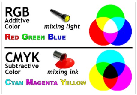
This process, if you like, is a subtracted process. So, in summary, you've have a red, green blue (RGB), when you're shining a light to add to get the colour required or in printing, you use a C-M-Y-K process so that you are subtracting colour from the white light.
You'll have noticed that one has three and CMYK four colours
Why is that? The reason being, of course, is when you're printing, you start with a colour, white, the paper. In principle C, M, and Y put together would create black, but because you've have white underneath it, to get the real definition, you need to print the fourth colour black.
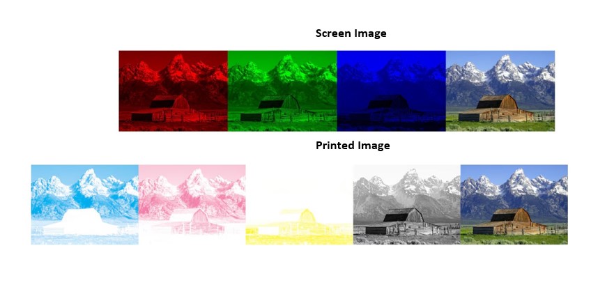
If we look at the images. We can see how to make up a four colour image using a red, green, and blue combination from light. Underneath the CMY and K.
So why am I telling you all of this? The reason being is that what happens quite often is that when you look at colour on your screen and then your printer sends you the printed version, they may look slightly different. The reason for that is fundamentally you're comparing two different colour systems. One is red, green, blue, the other one is CMYK. Now, they won't always show variation, and that the variation will be very small, but you can get a variant. So how do you stop the variation? Some very clever people in an organization called Pantone decided to define every single colour in the rainbow.
They did this, with what is termed a Pantone book, where they defined every colour in terms of its CMY and K values.
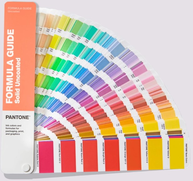
What that means is, if you've have a particular colour for your logo, the in-house brand colour, if it's defined as a Pantone reference, then whether you are printing it in New York, Sydney or London, every printer in the world will recognize a Pantone reference and therefore it locks that colour.
Just as an aside, you'll also find that some lithographic printers will print five colours. If your brand colour is specific and it covers a large area of a brochure, in order to maintain that, Pantone absolutely spot on, what the printer can do is mix the Pantone colour ink from CMY and K, and print as a fifth colour, rather than rely on the eye to do the process of combining the colours.
That's sometimes referred to as a spot colour.
I mentioned Hexachrome. Hexachrome was a system invented by Pantone, and the idea there was to add two more colours, an orange and a green, and the thought process was that what it would do is define colour and get much better definition and depth of colour. It is pretty well defunct as far as small format printers are concerned. You might find it in large format printing, where you're printing a poster, particularly for the retail industry when printing pictures of clothing where colour is absolutely vital. So, you might find it in large format, but generally Hexachrome is not a printing technique that you'll come across.
Hopefully that was useful. If you have any specific questions about colour, whether it relates to a job that PDI has done or not, then do get in contact. Happy to have a chat and try and solve your colour problems. Thank you.
You can also watch the video here
Thanks for the images should go to:
https://pavilion.dinfos.edu/Article/Article/2355687/additive-subtractive-color-models/
https://maggiesscienceconnection.weebly.com/visible-light--color.html
Author: David Platt, BSC, BA, MBA. Dip. M
David has been involved in print and promotional products for 30 years, as Executive Director of PDI – he has the scars of printing colour to match client requirementsover many year, as well as a formal education in Business Management and Marketing.